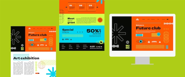
In today’s digital age, a visually appealing and responsive website is a fundamental requirement for any business or individual seeking to make an impact online. One of the most powerful tools in a web designer’s arsenal is Bootstrap, a front-end framework that simplifies the process of creating stunning and user-friendly websites. In this article, we delve into one of Bootstrap’s versatile classes, the d-block w-100, and explore how it empowers designers to create dynamic and responsive web layouts. From its basic implementation to advanced use cases, we’ll uncover the limitless possibilities that d-block w-100 offers, allowing you to captivate your audience and provide an exceptional browsing experience.
Understanding Bootstrap and its Core Principles
Before diving into the intricacies of d-block w-100, let’s take a moment to understand the basics of Bootstrap. Developed by Twitter, Bootstrap is an open-source framework that provides pre-designed HTML, CSS, and JavaScript components, making it easier to build visually appealing and responsive websites. Bootstrap’s core principles revolve around a mobile-first approach, grid system, and a wide array of classes that facilitate rapid development.
Introducing the d-block w-100 Class
The d-block w-100 class is a powerful utility in Bootstrap that allows designers to create full-width, block-level elements. By default, HTML elements are inline or inline-block, which limits their width to the content they contain. However, by applying the d-block class, an element becomes a block-level element, taking up the full width available within its parent container. The w-100 class, when used in conjunction with d-block, ensures that the element occupies 100% of the available width, stretching it from edge to edge.
Basic Implementation and Use Cases
Implementing d-block w-100 is incredibly straightforward. Simply add the classes “d-block” and “w-100” to the desired element’s class attribute. This enables you to create visually appealing full-width elements such as banners, headers, or sections within your website. By using d-block w-100 on a div element, you can create visually distinct sections that span the entire width of the screen, regardless of the content’s length.
Here are a few use cases for d-block w-100:
- Full-Width Banners: Create captivating banners that span the entire width of the screen, effectively grabbing the attention of your visitors;
- Hero Sections: Utilize d-block w-100 to construct hero sections that make a strong visual impact and provide a clear focal point for your website’s message;
- Showcasing Images: Make your images stand out by utilizing d-block w-100 within an image container, ensuring they occupy the full available width and enhancing their visual appeal.
Advanced Techniques and Customization
While the basic implementation of d-block w-100 is powerful on its own, Bootstrap offers various customization options that enable you to tailor the class to suit your specific design requirements.
- Nested Containers: You can nest containers within a d-block w-100 element to create visually distinct sections within a full-width layout. This allows for greater flexibility in organizing content and enhances the visual hierarchy of your design;
- Responsive Design: Bootstrap’s d-block w-100 class seamlessly adapts to different screen sizes, ensuring your website remains visually pleasing and functional across various devices. By utilizing responsive utility classes, such as d-md-block or d-lg-block, you can control the visibility of elements on specific screen sizes;
- Combining Classes: Bootstrap’s modular approach allows you to combine classes, enabling more advanced designs. For example, by combining d-block w-100 with other classes like p-4 (padding) or bg-primary (background color), you can create visually striking and customized elements.

Comparison Table
To provide a comprehensive overview, here’s a comparison table highlighting the differences between d-block and d-block w-100:
| Class | Description |
|---|---|
| d-block | Converts an element into a block-level element |
| d-block w-100 | Extends the block-level element to 100% width |
Conclusion
In conclusion, Bootstrap’s d-block w-100 class serves as a game-changer for web designers, revolutionizing the way we create visually stunning and responsive web layouts. By harnessing the power of this versatile utility, designers can transcend the limitations of traditional inline or inline-block elements, opening up a world of possibilities to captivate and engage their audience.
The d-block w-100 class empowers designers to create impactful full-width banners that immediately grab the attention of visitors, conveying a powerful message and setting the tone for the entire website. It enables the construction of hero sections that act as visual anchors, guiding users through the website and emphasizing the most important content.
Furthermore, d-block w-100 allows for seamless integration of images, ensuring they shine by occupying the entire available width. By leveraging this class within an image container, designers can create visually immersive experiences that leave a lasting impression on visitors.
What sets d-block w-100 apart is its adaptability across different screen sizes and devices. With the responsive design principles deeply embedded in Bootstrap, the d-block w-100 class ensures that your website remains visually pleasing and functional, regardless of whether it is viewed on a desktop, tablet, or mobile device. By utilizing additional responsive utility classes, such as d-md-block or d-lg-block, designers can fine-tune the visibility of elements to deliver a consistent and optimized experience across various devices.
Whether you are a novice or an experienced designer, integrating the d-block w-100 class into your toolkit is a decision that will undoubtedly elevate your web design skills. The ability to create modern, visually impressive, and responsive web layouts will set your projects apart from the competition. Embrace the power of d-block w-100, experiment with its combinations, and unleash your creativity to craft captivating websites that leave a lasting impact on your audience. With Bootstrap’s d-block w-100 class, the possibilities are endless, and the journey towards exceptional web design begins now.
