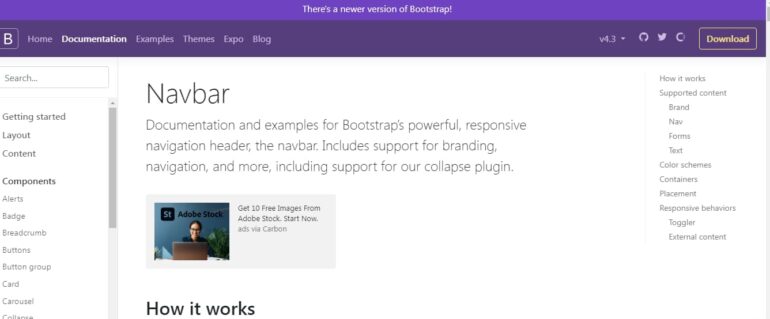
The navigation bar stands at the forefront of crafting a memorable and engaging user experience. It’s the initial feature that visitors encounter when they land on a site, and it can significantly shape their perception of your brand.
By the close of this article, you’ll be equipped with the expertise to construct a navigation bar that makes a lasting impact.
The Artistry in Layout
Central to any remarkable Bootstrap navigation menu is its design acumen. Embarking on the path to a noteworthy menu begins with a deep dive into the site’s visual identity. Pose questions to yourself like:
- What palette of colors defines my site?;
- What typography and font choices am I incorporating?;
- Which images will enhance my brand identity?
With a reflection on these aspects, you can tailor your navigation menu to resonate with your website’s theme. Bootstrap brings to the table a suite of classes, hues, and designs to dress up your navigational components. Engage your artistic side to elevate your navigation menu’s aesthetic appeal while ensuring it reflects the site’s subject matter.
Icons and Aesthetics
Adding graphical icons or images to navigation items can transform a basic bar into an engaging and straightforward guidepost for users. Take advantage of Bootstrap’s suite of icon classes or craft your unique imagery to bestow a distinctive charm to your menu options. Icons are a potent way to convey the purpose behind a menu selection, transcending the need for text alone.
Animation and Engagement Elements
Incorporating elements of interaction within your navigation bar can mesmerize and retain visitor attention. Bootstrap offers classes tailored for adding life through animation and hover responses, like .nav-link and .dropdown-toggle.
Employ these to weave in delicate animations or response effects as users interact with your navigation elements, boosting creativity and inviting deeper site engagement.
Responsive Navigation Design
It’s imperative for your navigation design to be responsive, accommodating the array of devices used to access your site. Bootstrap simplifies this with tools like .navbar-toggler and .collapse, making it straightforward to craft a mobile-friendly navigation experience. Reflect on your navigation’s adaptability from desktop to mobile views to ensure it operates smoothly on any device.
Having explored these inventive design techniques for a Bootstrap navigation menu, you’re ready to apply this new insight. Moreover, you can learn how to center a DIV using Bootstrap. Venture into various blends of design components, fonts, icons, animations, and responsive features to construct a navigation menu that’s as functional as it is visually arresting.
Conclusion
Your site is worthy of a navigation menu that’s both aesthetically pleasing and easy to navigate, and Bootstrap’s breadth of options can facilitate this. Initiate your project now, and you’ll see your site’s navigation evolve into an impactful work of digital art, leaving a memorable mark on all who visit.
