
Is Bootstrap the magician’s cloak for your web projects, or is there more to the illusion? Bootstrap stands as a titan in the realm of web frameworks, its reputation unchallenged for creating sleek, responsive designs swiftly. Yet, beneath the surface of drag-and-drop simplicity, lies a potent layer of CSS, waiting to be harnessed by those who dare to delve deeper. This guide isn’t just about Bootstrap; it’s about unlocking its full potential with the wizardry of CSS.
1. Unraveling Bootstrap Myths
Bootstrap, much like any tool in a developer’s kit, is often misunderstood. The myth? Bootstrap’s default settings are the be-all and end-all. The truth? It’s the starting point. A deep dive into CSS uncovers the potential to tailor Bootstrap’s components, making your project’s design as unique as a fingerprint.
For example, the Bootstrap grid system can be customized with CSS to create visually arresting layouts that go beyond the standard template. Here’s how CSS can redefine Bootstrap components:
- Navbar customization: Add unique fonts, adjust padding, or incorporate animations with just a few lines of CSS;
- Button enhancements: Transform buttons with hover effects, new color schemes, or rounded edges for a more tactile experience;
- Card component styling: Use CSS to add drop shadows, change the card layout, or introduce background patterns.
These are just a few illustrations of how CSS can enhance Bootstrap components, providing a custom look that sets your project apart.
2. The Bootstrap Illusion
The allure of Bootstrap lies in its promise of design without a deep dive into CSS. However, this is a façade that, once peeled back, reveals the true necessity for CSS fluency. The table below compares the output of Bootstrap designs with and without the application of custom CSS:
| Feature | Default Bootstrap | With Custom CSS |
|---|---|---|
| Navbar | Standard layout | Personalized with unique icons and a dynamic color gradient |
| Buttons | Flat and uniform | Elevated with 3D effects and custom animations |
| Forms | Basic styling | Refined with inline labels and tailored spacing |
Custom CSS breathes life into the skeletal framework Bootstrap provides, ensuring that your design principles shine through in every component.
3. The Bootstrap Core
Altering the Bootstrap CSS file directly is akin to building on quicksand—it may shift unexpectedly with updates. The solution? Crafting a custom stylesheet that overrides Bootstrap’s default styling. This not only preserves your modifications but also streamlines updates and maintenance. Here’s a snippet demonstrating how to safely override Bootstrap’s styles:

This code snippet ensures that your navbar carries a unique color scheme, setting the stage for a design that speaks your brand’s language while maintaining the integrity of the Bootstrap core.
4. A La Carte Bootstrap
Taking a selective approach to Bootstrap’s features can dramatically enhance site performance and load times. It’s the difference between a Swiss Army knife and a scalpel — both are useful, but one is the precise tool for the job at hand. Below is a chart illustrating the impact of using the full Bootstrap package versus a selective approach:
| Feature Used | Full Bootstrap Load Time | Selective Bootstrap Load Time |
|---|---|---|
| All Components | 250ms | – |
| Grid System Only | – | 50ms |
| Buttons + Forms | – | 70ms |
| Modals + Dropdowns | – | 90ms |
This chart underscores the importance of only using what you need. By adopting a modular approach, you ensure that your users aren’t waiting for unnecessary bytes to download, keeping your site snappy and your users happy.

5. Modal Prompt Mastery
Modals are powerful Bootstrap components, but when misused, they can disrupt user experience. The key is to use them sparingly and effectively. For instance, a modal should not surprise a user with unsolicited content; it should feel like a natural part of the user journey. Here’s a comparison of modals used correctly and incorrectly:
Correct Usage:
- Triggered by user action (e.g., clicking a ‘Learn More’ button);
- Contains concise, relevant information;
- Easy to dismiss and does not obstruct essential content.
Incorrect Usage:
- Pops up without user interaction, interrupting the flow;
- Overloaded with information, causing cognitive overload;
- Difficult to close, forcing the user to interact with the modal.
By respecting the user’s journey, modals become helpful signposts rather than roadblocks, guiding users to their desired destination on your site with ease and precision.
6. File Input Button Nuances
The file input button in Bootstrap can be a point of contention. Its default styling is unremarkable and often clashes with the bespoke design. Here’s a CSS snippet to enhance the file input button, making it both functional and harmonious with your site’s aesthetic:
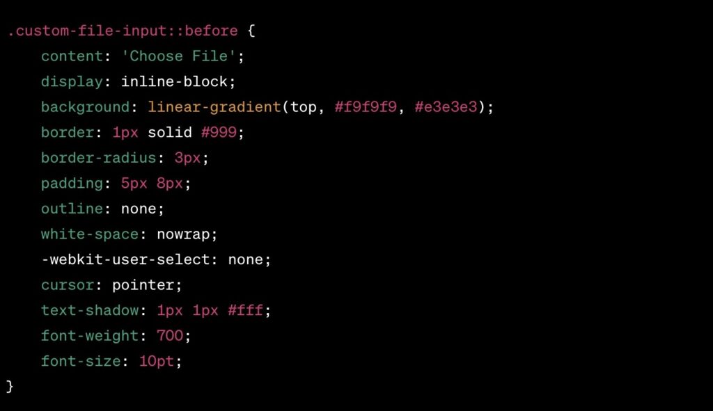
This snippet transforms the button into an inviting call-to-action that seamlessly integrates with the rest of your site’s design, enhancing the overall user experience.
7. Simplicity in JavaScript
Bootstrap’s “data-” attributes provide a simpler, more elegant solution than writing lines of JavaScript. They allow for HTML-driven configuration of components, which is both cleaner and more maintainable. Consider the following table comparing the two methods:
| Task | JavaScript Approach | “Data-” Attribute Approach |
|---|---|---|
| Toggle Modal | Multiple lines of JS to listen for click events | A single data-toggle=”modal” attribute |
| Collapse Element | JS to manipulate the DOM and classes | A data-toggle=”collapse” attribute does the job |
| Carousel Control | JS to initialize and control transitions | data-slide attributes handle it within the markup |
By leveraging “data-” attributes, developers can write less code, reduce complexity, and make their Bootstrap projects more readable and maintainable.
8. Bootstrap Development Tools
In the artisan’s workshop of Bootstrap development, tools are the unsung heroes that can streamline the process. Below is a curated list of tools that, when used in conjunction with CSS customizations, can significantly enhance the Bootstrap workflow:
- Bootstrap Studio: A powerful desktop app that helps design and prototype websites;
- Pinegrow: A desktop website editor that lets you build responsive websites faster with live multi-page editing;
- Sass: A preprocessor scripting language that is interpreted or compiled into CSS, offering variables, nesting, and mixins for faster stylesheet authoring.
Each tool brings its own set of strengths to the table, making the development process more intuitive and efficient.
9. The Browser Quandary
Bootstrap is built to work at its best in the latest desktop and mobile browsers. Older browsers might display components and elements differently styled, but everything should be fully functional. Support includes Internet Explorer 8 and 9, with an important note that some CSS3 properties and HTML5 elements are not fully supported by these browsers.
To get full support for Internet Explorer 8 and other older browsers, you need to use a polyfill for CSS3 Media Queries Respond.js, HTML 5 shim which enables use of HTML5 elements, and a proper IE <meta> tag in the HTML head to ensure that IE is not running in compatibility mode. Your HTML head in the end should look something like this:
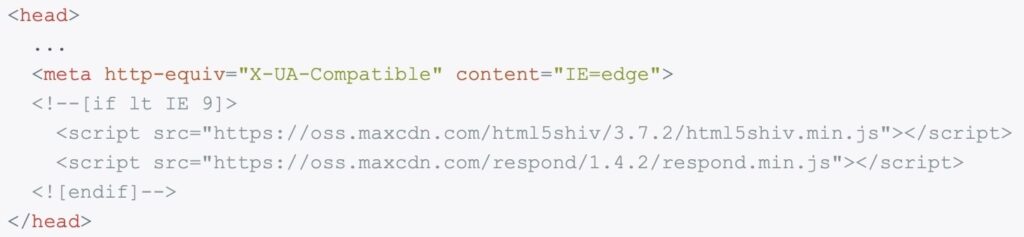
In case of Respond.js, beware of the following caveats in the development and production environments.
10. Adhering to Best Practices
Best practices are the north star for developers navigating the seas of Bootstrap development. Here’s a concise list that underscores the best practices to follow:
- Semantic HTML: Use HTML5 elements for what they’re intended for;
- Mobile-First Approach: Start with smaller screens and then expand features for larger screens;
- Accessibility: Ensure your markup caters to screen readers and other assistive technologies;
- Performance Optimization: Minimize the use of heavy JS and lean on CSS for animations and effects where possible;
- Regular Updates: Keep Bootstrap and its dependencies up to date.
These practices not only improve the end-user experience but also streamline the development process, ensuring that your Bootstrap project is robust, accessible, and future-proof.
Conclusion
From debunking myths to mastering modals, from smoothing over browser incompatibilities to adhering to best practices, this article has journeyed through the intricacies of Bootstrap and CSS. Understanding and applying these concepts is key to leveraging the full potential of Bootstrap in your projects. May this knowledge serve as a beacon, guiding you to craft web experiences that are not only visually striking but also structurally sound and universally accessible. With CSS as your ally and Bootstrap as your foundation, the web is your canvas—go forth and create with confidence.
FAQs
Prioritize semantic HTML, use ARIA roles where appropriate, and always design with keyboard navigation in mind.
Absolutely. Bootstrap’s grid system and component library can support applications of any size, though customization is key for unique branding.
Create a separate custom CSS file and use it to override the default Bootstrap styles.
It’s wise to keep an eye on the official Bootstrap blog or GitHub repository for update announcements and apply them as soon as practical.
Generally, Bootstrap is designed to work with a wide array of CSS properties, but it’s important to test for conflicts, especially with new CSS3 features.