Selecting the appropriate typeface for your website plays a pivotal role in shaping the user’s overall experience. Google Web Fonts, a readily accessible and cost-free tool, provides an extensive array of top-tier fonts capable of elevating both the readability and aesthetic appeal of your site. Within the confines of this article, we shall delve into the top 20 Google Web Fonts that possess the potential to set your website apart from the rest.
Exploring the Diversity of Google Fonts
Google Fonts emerges as a treasure trove of typography, boasting a collection that exceeds a thousand font families at no cost. This expansive repository serves as a dynamic catalog, accessible through a user-friendly interface that allows for the effortless exploration and comparison of typefaces. The integration of these fonts into web pages and mobile applications is streamlined through the provision of Application Programming Interfaces (APIs) tailored for CSS and Android platforms.
- Extensive Library: Users can choose from an extensive variety of typefaces, ranging from classic serifs to contemporary sans-serifs, along with handwritten styles and more;
- Ease of Access: The interactive directory facilitates the discovery of the perfect font by allowing users to test and preview fonts online;
- Seamless Integration: Developers can easily incorporate fonts into their projects through APIs, enhancing the design process;
- Cross-Platform Compatibility: The fonts are designed to work across different browsers and devices, ensuring a consistent user experience.
As a font resource, Google Fonts provides an invaluable asset for designers and developers aiming to bring a unique voice to their websites and applications.
The Art of Font Selection in Web Design
Selecting an appropriate typeface is a pivotal decision in the realm of web design, one that extends far beyond mere aesthetics. The chosen font has the power to influence not only the readability of content but also the atmosphere of the website and the psychological response of its visitors. An optimal typeface selection reinforces the brand’s identity and cultivates trust among users, while also elevating the overall experience of navigating through the site.
Key Considerations for Font Selection:
- Readability: Prioritize fonts that offer clarity and ease of reading to ensure that the message is conveyed effectively;
- Brand Congruence: Choose a font that reflects the essence of the brand, whether it be professional, whimsical, or innovative;
- Emotional Impact: Consider the emotional tone the font may set – formal fonts may impart seriousness, while playful fonts might evoke a light-hearted feel;
- User Experience: Ensure the font enhances, rather than hinders, the user’s ability to interact with the site.
Tips for Effective Font Usage:
- Contrast: Use contrasting font weights and sizes to establish a visual hierarchy and draw attention to key sections of content;
- Pairing: When pairing fonts, aim for a balanced combination that complements rather than clashes;
- Consistency: Maintain consistency across different pages and elements to provide a cohesive brand experience;
- Performance: Keep an eye on font loading times as they can affect your site’s performance and user satisfaction.
By giving careful attention to typeface selection, web designers can significantly bolster the communicative strength and aesthetic appeal of a website.
The Definitive Selection of Top Google Web Fonts for Elevating Your Website’s Aesthetics
Google Web Fonts offers an expansive selection of typefaces suitable for a myriad of designs and purposes. The following are some of the standout fonts that can transform the appearance and feel of your website, making it not only appealing but also accessible and user-friendly.
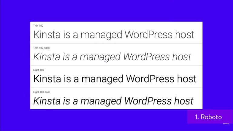
1. Roboto: The Epitome of Modern Typography
- Design Traits: Boasting a mechanical infrastructure beneath its sleek exterior, Roboto is a testament to the harmony between precision and approachability. The font’s geometric nuances provide a contemporary and uncluttered appearance;
- Applications: This font is exemplary for interfaces where clarity and efficiency are paramount. It’s versatile enough for both body text and headings, lending itself well to responsive design.
2. Open Sans: Versatility Meets Warmth
- Characteristics: Open Sans strikes a balance between neutrality and friendliness. Its open forms make it highly legible and inviting, creating a welcoming user experience;
- Usage Recommendations: Ideal for both digital displays and print, Open Sans is a workhorse for web content, excelling in everything from titling to lengthy paragraphs without losing readability.
3. Lato: Embracing Elegance and Functionality
- Font Profile: Lato encapsulates a dual nature: it carries an underlying warmth that makes it feel humane, while also holding onto a strong presence and professionalism;
- Ideal Use Cases: With its semi-rounded details, Lato is an excellent choice for brands looking to project stability and friendliness. It’s well-suited for corporate websites, e-commerce platforms, and informative blogs.
4. Montserrat: A Nostalgic Revival
- Aesthetic Essence: Montserrat is a nod to the historical typography of Buenos Aires, reviving the character seen in the early 20th-century posters and signs with a fresh, modern twist;
- Where It Shines: Perfect for creative websites, this font stands out in headings and can give branding a unique edge, distinguishing it from the contemporary sans-serif crowd.
5. Oswald: Digitally Optimized Elegance
- Font Attributes: Re-envisioned for the digital landscape, Oswald has been expertly adapted for use on various digital platforms, marrying the tradition of print with the functionality of screen display;
- Placement Tips: Its sturdiness makes it a great candidate for headers and navigation menus on websites, as well as mobile app interfaces.
6. Source Sans Pro: A UI/UX Powerhouse
- Design Philosophy: As the brainchild of Adobe’s foray into open-source typography, Source Sans Pro was meticulously crafted with user interfaces as its primary focus, boasting a professional yet unassuming style;
- Optimal Utilization: It excels in user interfaces and is highly recommended for web applications and tech-related websites.
7. Raleway: The Quintessence of Refinement
- Design Aesthetic: Raleway brings an air of sophistication with its elegant lines, designed with the intention of being utilized at substantial sizes for high impact;
- Effective Use: This typeface is particularly suited for luxury brand websites, fashion portals, and any platform where style is a priority.
8. Poppins: A Contemporary Sans Serif Marvel
- Visual Characteristics: As a contemporary addition to the sans serif family, Poppins brings a blend of traditional geometry and modern fluidity;
- Design Context: This typeface is perfect for startups and tech companies looking to project innovation and modernity.
9. Noto Sans: The Vision of Universal Typography
- Innovative Concept: Noto Sans was created with an ambitious goal in mind: to provide seamless support for all scripts encoded in the Unicode standard, making it a global player in the typography world;
- Universal Application: Given its extensive language support, it is perfect for international organizations, educational platforms, and any site aiming for a broad global reach.
10. Merriweather: Designed for Supreme Screen Readability
- Font Features: Merriweather is crafted with on-screen reading in mind, featuring robust serifs that guide the reader’s eye and aid in the legibility of text on various digital displays;
- Best Practices: This font excels on editorial sites, e-books, and any platform where long-form articles and texts are the main content.
11. Arimo: The Vanguard of Sans Serif
- Unique Features: Arimo breathes new life into the familiar landscape of sans serif fonts, offering a fresh perspective on classic simplicity;
- Why Choose Arimo: This font is particularly effective for businesses aiming for a minimalist yet innovative branding approach. It provides excellent legibility across devices and resolutions.
12. Ubuntu: The Heart of Open-Source Design
- Origin Story: Commissioned by Canonical for its own Linux distribution, the Ubuntu font family is as versatile and user-friendly as the operating system it represents;
- Diverse Applications: Given its origins, Ubuntu is a font of choice for tech companies, developers’ personal blogs, or any platform that values open-source ethos.
13. PT Sans: The Professional’s Typeface
- Design Purpose: Crafted with a clear focus on user interfaces and corporate documentation, PT Sans is utilitarian by design, facilitating effortless reading and clarity;
- Professional Utilization: It’s a solid selection for business sites, digital platforms offering extensive resources, or any professional services that require a clean and clear presentation of text.
14. Playfair Display: The Art of Elegance
- Stylistic Flair: With its origin in the Enlightenment and the transition into modern times, Playfair Display is high-contrast and exquisitely styled for the dramatic;
- Perfect Pairings: This typeface shines in creative headlines, editorial titles, and as a complement to less adorned body text, offering an unmistakable grandeur.
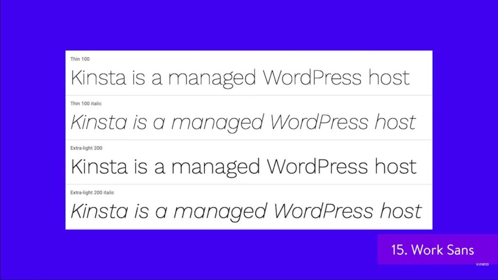
15. Work Sans: A Typographic Workhorse
- On-Screen Optimization: Engineered for digital interfaces, Work Sans is a variable font family that provides excellent legibility and readability across its weight spectrum;
- Tailoring Tips: The versatility of Work Sans makes it ideal for a multitude of web content, from long-form articles to concise labels in UI/UX design.
16. Barlow: A Gentle Touch of Modernity
- Design Philosophy: Barlow combines the neutrality of a grotesk typeface with subtle rounded edges, offering a low-contrast and reader-friendly experience;
- Application Insight: It’s a suitable font for those seeking modernity without the harshness of sharp edges, applicable in a range of settings from app design to responsive websites.
17. Fira Sans: Humanist Flair in Sans Serif
- Creator’s Vision: Imagined by the renowned Erik Spiekermann, Fira Sans was designed with the nuances of humanist traits to enhance its legibility and friendliness;
- Use Recommendations: An excellent option for brands emphasizing approachability and readability, particularly effective for mobile and web apps user interfaces.
18. Zilla Slab: The Friendly Contemporary
- Mozilla’s Brainchild: Conceived by Mozilla, Zilla Slab stands out with its contemporary slab serif design that exudes a friendly yet commanding presence;
- Best Use Scenarios: This font is apt for web content that desires a balance between being authoritative and approachable, from tech blogs to journalism websites.
19. Rubik: The Digital Native
- Design Aspects: Rubik is a soft sans serif with just the right amount of rounded corners to provide a digital-first experience without sacrificing character and form;
- Why Rubik Works: It’s excellent for interactive web environments where a touch of softness can enhance digital aesthetics, such as educational platforms or children’s websites.
20. Bitter: The Serif for Screen Superiority
- Contemporary Design: Bitter is a modern serif typeface with a touch of warmth, designed specifically to provide a delightful reading experience on any screen;
- Why Choose Bitter: With its screen-optimized design, it’s well-suited for digital publications, e-books, and any online platform that prioritizes text content for continuous reading.
These Google Web Fonts are not just tools for presenting content but vital components that shape the user’s visual journey through a website. By carefully selecting the appropriate typeface, one can influence the accessibility, user experience, and overall brand message conveyed to visitors. The above fonts are not only chosen for their aesthetic appeal but also for their functionality and adaptability to various design needs. Discover the freedom to craft stunning websites without limits using an offline Bootstrap builder!
Mastering the Utilization of Google Web Fonts
When leveraging Google Web Fonts to enhance your website’s typography, it’s essential to make informed choices to maintain both aesthetic appeal and website performance. Here are some refined strategies and best practices:
- Monitor Font Loading Performance: Font loading times can affect your site’s speed, which is a crucial factor for user experience and SEO. Select fonts that balance design and performance.
- Utilize tools like Google’s PageSpeed Insights to evaluate the impact of fonts on load time;
- Consider using font display strategies such as ‘swap’ or ‘fallback’ to minimize visibility of unstyled text.
- Cohesive Font Pairing: Choose typefaces that share a visual harmony, aiming to match fonts that complement each other’s style and weight. This synergy between fonts can greatly enhance your site’s visual coherence.
- For titles and body text, pair a serif with a sans-serif to create a dynamic contrast;
- Avoid mixing fonts with too similar proportions or x-heights, which can look unintentional and confusing.
- Limit Typeface Variety: While it’s tempting to use multiple font styles, restraint is key. Aim to use no more than three typefaces to establish a polished and professional design landscape.
- Select one font for headers, another for body text, and possibly a third for accents or calls to action;
- Each typeface chosen should serve a clear purpose and contribute to the site’s readability.
- Cross-Device Readability Checks: It’s paramount to ensure that your chosen fonts are legible across various devices and resolutions.
- Conduct tests on different smartphones, tablets, and monitors;
- Pay attention to font sizes, spacing, and contrast ratios to guarantee that texts are accessible on all screens.
Seamless Integration of Google Fonts into Your Website
Incorporating Google Web Fonts into your website can be achieved with minimal hassle but should be done with attention to detail to ensure technical and visual excellence. Here’s how to do it:
- Utilize the Google Fonts API: This powerful interface allows the seamless addition of fonts through a simple line of code in your HTML or CSS file.
- First, select the desired font from the Google Fonts directory;
- Use the API provided by Google Fonts to include the font in your website without needing to host the font files yourself.
- Embedding the Code Snippet: Add the provided snippet from Google Fonts to your website’s <head> section or directly within your CSS stylesheets.
- Ensure the correct font weights and styles are selected to avoid loading unnecessary variations;
- Regularly update the code snippet if you make changes to the fonts on the Google Fonts platform to keep everything synchronized.
- Customization for Enhanced Performance: Customize your font selection by specifying the character sets and subsets to avoid loading unnecessary characters that won’t be used on your website.
- If your website targets a multilingual audience, include only the necessary subsets to support the languages of your visitors;
- Explore the use of ‘font-display’ CSS property to control how fonts are displayed as they are loaded.
FAQ
Yes, Google Web Fonts are free to use for both personal and commercial projects.
Google Web Fonts are designed to be cross-browser compatible and should work on most modern browsers and devices.
Consider your brand’s personality, the readability of the font, and how it complements your website’s design
Conclusion
Selecting the perfect Google Web Font can significantly enhance your website’s aesthetics and enhance the overall user experience. By harnessing the power of the top 20 Google Web Fonts mentioned earlier, you have the opportunity to craft a website that not only captivates the eye but also ensures easy readability, setting it apart from the rest.