
Implementing a Fixed Bottom Footer in Bootstrap
Follow these steps to ensure that the footer remains at the bottom of the page even when there is insufficient content to push it down.
Step 1:
To ensure that the footer remains at the bottom of the page, you need to add the following Bootstrap classes to the <body> tag or a wrapper:
<body class="d-flex flex-column min-vh-100">This code makes the element flex, arranges the content in columns from top to bottom, and sets a minimum height of 100vh, which means it will occupy 100% of the viewport’s height.
Step 2:
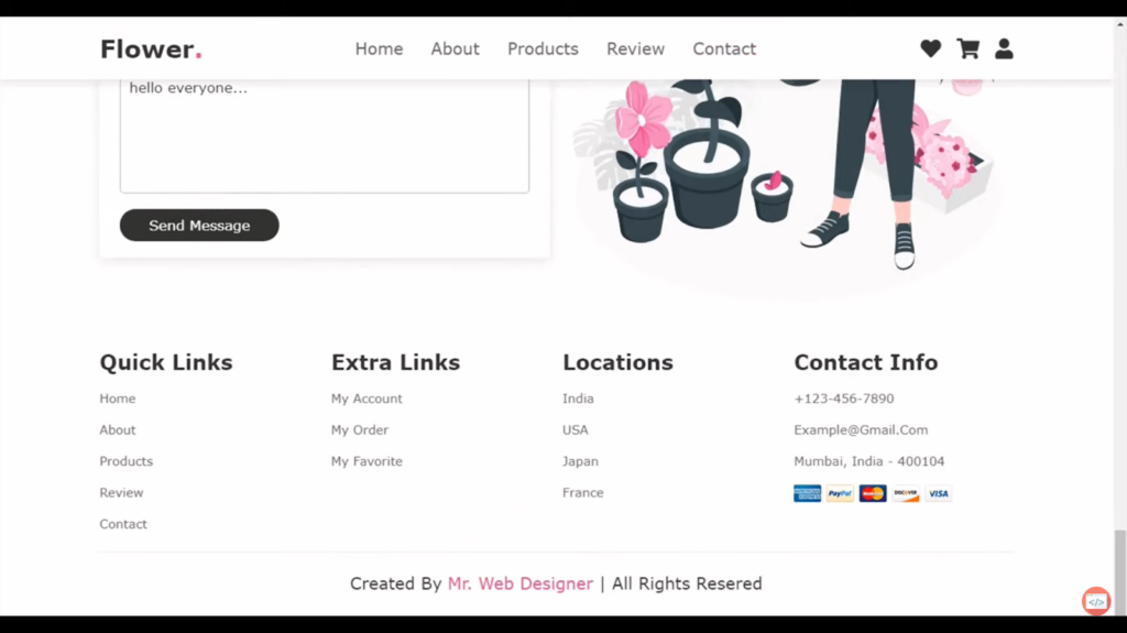
If you have an <footer> element or a wrapper for the footer, add the ‘mt-auto’ class to it:
<footer class="mt-auto">The ‘mt-auto’ class sets the margin-top to auto, which is what pushes the footer to the bottom of the page.
Resolving Design Problems
In general, if the code is implemented correctly, there should be no issues. However, there might be cases where certain elements were not configured appropriately, leading to unexpected results. For instance, forgetting to set the menu wrapper to width: 100% can cause the menu items to gather in the center when applying the mentioned Bootstrap code.
Conclusion
I sincerely hope that this comprehensive tutorial has been instrumental in guiding you toward successfully achieving your goal of keeping the footer consistently positioned at the bottom of your web page. By following the step-by-step instructions and implementing the necessary Bootstrap classes, you have taken a significant stride in enhancing the overall design and user experience of your website. Should you encounter any challenges or require further assistance, please do not hesitate to seek additional resources or reach out for support. Wishing you continued success in all your future web development endeavors!
FAQ
To set a footer in Bootstrap, you can utilize the ‘<footer>’ tag and apply relevant Bootstrap classes to style it. By placing the necessary content within the footer element and utilizing Bootstrap’s grid system or utility classes, you can easily position and style your footer according to your design requirements.
A sticky footer in Bootstrap is a footer that remains fixed at the bottom of the page, regardless of the content’s height. It “sticks” to the bottom even when there is not enough content to fill the entire viewport. This can be achieved by utilizing CSS and Bootstrap classes like ‘fixed-bottom’ and custom CSS properties like ‘position: fixed’ and ‘bottom: 0’.
To create a fixed header and footer in Bootstrap, you can use the Bootstrap grid system or utility classes to define the layout structure. Apply relevant classes such as fixed-top for the header and ‘fixed-bottom’ for the footer. These classes ensure that the header and footer remain fixed at the top and bottom of the viewport, respectively, even when the page is scrolled.
Yes, Bootstrap provides a ‘footer’ class that can be used to style the footer section of your webpage. However, it’s important to note that this class only provides basic styling and does not include any positioning or fixed behavior. You can use additional Bootstrap classes or custom CSS to position and style the footer according to your specific requirements.