With the surging use of mobile devices for web access, developing responsive websites has become indispensable. Responsive web design encompasses the creation of websites that adapt to the size and resolution of the device’s screen through which they’re accessed. This assures a well-functioning, visually appealing site across all devices, including desktops, laptops, tablets, and smartphones.
Among the prevalent front-end frameworks utilized in web development is Bootstrap. It’s designed to expedite and simplify responsive web design. Among its key attributes are media queries and breakpoints, enabling developers to craft responsive websites optimized for all devices.
In this comprehensive guide, we delve into Bootstrap’s media queries and breakpoints, exploring their function across different devices and their utilization in Bootstrap for creating responsive designs.
What is a Media Query?
Media queries (MQs) are a CSS technique employed to apply styles grounded on the characteristics of the device or browser used for viewing the website. Specifically, they enable developers to outline distinct styles for varying screen sizes, resolutions, and orientations, ensuring optimal site appearance on any device.
MQs comprise two parts:
- a media type;
- one or more expressions outlining the conditions under which the styles should be implemented.
For instance, the type could be “screen”, and the expression could be “max-width: 767px”, signifying that the styles should be applied exclusively to screens with a width of 767 pixels or less.
How Do Media Queries Operate on Various Devices?
Media queries are inherently designed to operate seamlessly on all CSS-enabled devices. However, the varying screen sizes and resolutions of different devices influence how MQs are interpreted and applied. Consequently, the usage of breakpoints is vital for accurate functionality across all platforms.
Breakpoints are essentially predefined screen dimensions corresponding to specific categories of devices, such as smartphones, tablets, and desktops. Bootstrap comes equipped with a range of such predefined breakpoints, simplifying the process of styling for each device category for developers.
Unpacking Breakpoints
Breakpoints essentially serve as markers in your code where the execution of the program can be paused by the debugger. This pause allows for an in-depth inspection and analysis of the code at that particular juncture.
Breakpoints come in multiple forms, including:
- Line breakpoints that halt the execution when a specified line of code is encountered;
- Method breakpoints that stop execution when a certain method is invoked.
Despite their utility, method breakpoints can be resource-intensive as the debugger must constantly monitor each method call, potentially leading to a slowdown in program execution. This effect is especially prominent if a method is invoked frequently or within a loop.
However, the actual impact on performance can vary greatly depending on the specific debugger and language being used, the program’s complexity being debugged, and other relevant factors. Hence, to mitigate excessive program slowdown, breakpoints should be judiciously used and only when absolutely necessary.
Breakpoint Features
It’s essential to remember that these dimensions relate to the width of the device or viewport in pixels. Bootstrap widely leverages these breakpoints to build responsive web designs compatible with all devices.
Bootstrap’s Predefined Media Queries and Breakpoints: Examples
As a prevalent framework, Bootstrap comes equipped with a collection of predefined CSS classes and components, easing the process of responsive web design. Embracing a mobile-centric approach, Bootstrap’s default styles cater to small screens and then enhance the design for larger screens using MQs and breakpoints.

Bootstrap provides six preset breakpoints catering to screen sizes ranging from ultra-small (XS) to ultra-large (XXL).
Here are the dimensions associated with each breakpoint:
| Breakpoint | Class infix | Dimensions |
|---|---|---|
| Extra small | None | <576px |
| Small | sm | ≥576px |
| Medium | md | ≥768px |
| Large | lg | ≥992px |
| Extra large | xl | ≥1200px |
| Extra-extra large | xxl | ≥1400px |
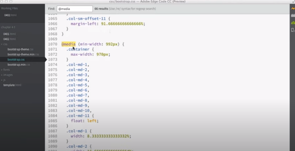
The MQs in Bootstrap are typically constructed using the @media CSS rule, setting a minimum or maximum width for a specific breakpoint.
Here are a few examples:
/* Extra small devices (portrait phones, less than 576px) */
@media (max-width: 575.98px) { ... }/* Small devices (landscape phones, 576px and up) */
@media (min-width: 576px) { ... }/* Medium devices (tablets, 768px and up) */
@media (min-width: 768px) { ... }/* Large devices (desktops, 992px and up) */
@media (min-width: 992px) { ... }/* Extra large devices (large desktops, 1200px and up) */
@media (min-width: 1200px) { ... }/* Extra-extra large devices (large desktops, 1400px and up) */
@media (min-width: 1400px) { ... }The application of these MQs enables the adjustment of CSS styles to cater to varying screen dimensions, concealing or revealing content depending on the screen size, and customizing the layout and positioning of various elements as per requirement.
In essence, Bootstrap’s embedded MQs and breakpoints provide a robust toolkit for fabricating responsive designs compatible with a plethora of devices and screen sizes.
Media Queries with Bootstrap: Is It Possible?
The answer is a resounding yes. As a popular CSS framework, Bootstrap comes equipped with an array of ready-to-use responsive components and a grid system, facilitating the creation of mobile-friendly and responsive web designs. Nevertheless, you may encounter situations where you’ll need to further personalize the layout or styles with MQs.
Media queries enable you to tailor different CSS styles depending on the attributes of the user’s device, such as screen size, resolution, or orientation. By using MQs in tandem with Bootstrap, you can construct more precise responsive designs and adjust your site’s appearance to suit different screen sizes or devices.
When using them in Bootstrap, you can write your custom CSS rules inside the MQ blocks.
Here’s a typical example:
/* Custom CSS styles for screens smaller than 768px */
@media (max-width: 767px) {/* Your CSS rules for smaller screens go here */
 .container {

    width: 100%;

  }

}
/* Custom CSS styles for screens between 768px and 991px */
@media (min-width: 768px) and (max-width: 991px) {/* Your CSS rules for medium-sized screens go here */
  .container {

    width: 80%;

  }

}
/* Custom CSS styles for screens larger than 992px */
@media (min-width: 992px) {/* Your CSS rules for larger screens go here */
  .container {

    width: 60%;

  }

}
The sample provided above demonstrates how CSS rules can be modified for the .container class, contingent upon screen size. The MQs outlined here determine different widths for the .container element, thus tweaking its size in accordance with the indicated screen size benchmarks.
Combining the responsive grid classes of Bootstrap with customized MQs allows you to devise intricate and flexible layouts for your site that perform well on a variety of devices and screen dimensions.
How Is Bootstrap Different from CSS Media Queries?
While serving distinct purposes, Bootstrap and CSS media queries can coalesce to engender a responsive design.
- Bootstrap: A CSS framework that equips you with a variety of pre-constructed components, a responsive grid system, and a set of CSS classes for uniformly stylizing elements. It introduces a standardized and effortless method to fabricate responsive web pages. With Bootstrap, you can foster responsive designs without composing extensive custom CSS or MQs;
- CSS media queries: CSS MQs are an inherent feature of CSS. They permit the application of different styles depending on the attributes of the user’s device, such as screen size, resolution, or orientation. MQs are employed to deliberately adjust the layout, style, or behavior of elements based on particular breakpoints.
The core difference lies in the degree of abstraction and intention:
- Bootstrap offers a higher degree of abstraction by providing a ready-to-use grid system, components, and styling options. It abstracts the necessity to manually write MQs for common responsiveness patterns;
- CSS MQs, a crucial feature of CSS, offer you complete control over customizing and adjusting styles based on specific breakpoints or device characteristics. They enable you to define your own responsive behavior and override the default styles if necessary.
Overall, Bootstrap simplifies the creation of responsive design by supplying a framework with predefined responsive behavior. In contrast, CSS MQs provide fine-tuned control for customization and allow you to create responsive designs that meet your unique requirements or surpass what Bootstrap provides by default. Both Bootstrap and media queries can work in harmony to produce flexible and responsive web designs.
Which Breakpoints Should You Use in 2023?
The selection of breakpoints to use in 2023 depends on several aspects, such as your target audience and the unique needs of your site. As different sites may have distinct requirements, there’s no universal answer to this question.
However, some common breakpoints can be used as a starting point. For instance, Bootstrap 4 suggests the following breakpoints:
- Extremely small devices (less than 576px);
- Small devices (at least 576px);
- Medium devices (at least 768px);
- Large devices (at least 992px);
- Extremely large devices (at least 1200px).
Other prominent frameworks, like Bulma and Tailwind, also recommend their own breakpoints. Moreover, tools like Google Analytics can help determine the most common screen sizes among your visitors and base your breakpoints on this data.
The ultimate objective of utilizing breakpoints is to ensure that your site appears and functions well on as many devices and screen sizes as possible. By selecting appropriate breakpoints and using MQs to tweak layouts and styles as required, you can design a responsive website that delivers an excellent experience on any device.
Conclusions
Bootstrap equips developers with an impressive set of predefined breakpoints and MQs that can be used to create responsive web designs. These breakpoints allow developers to adjust the layout and styles of their site according to the screen size of the viewing device.
This ensures the site remains visually engaging and functional, irrespective of the device type or screen size. Developers should make an effort to understand the purpose of each breakpoint and experiment with various media queries to customize the site design for their target audience.
By employing Bootstrap’s preset breakpoints, developers can create an enhanced user experience that will ultimately lead to increased user engagement on their site.
